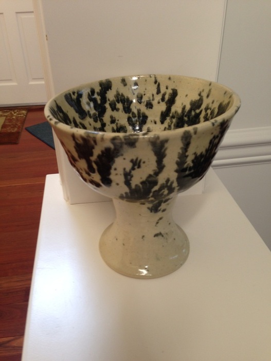
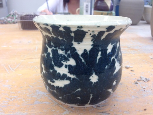
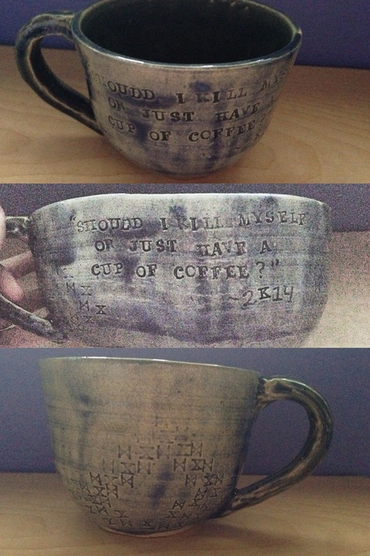
This is my multiwheel project! It's funny because at first I had no clue how to make something like this and I just totally winged it and it worked out! It's a little crooked but it's still pretty. I did lace attempt number 5 on this one because I wanted that stong black and white duality but didn't feel like coming up with a pattern before it got bisqued. The art element of this piece is shape because of how different of a shape this project is from all of my others. It is also dramatic because of the way it goes from small to big and from black to white. I don't really know what I'm going to do with this project but I like it a lot.
This is my punny teapot! It is a multi wheel since I had to make the body, spout and lid separately and then attach them all. It was really fun to make this teapot but it was also a LOT of work and I had to go through the struggle of reattaching the letters and the glaze being way too thin. But I am excited that I have a teapot now that is completely functional and can strain the tea and is even purple, which is one of my favorites. It has a sort of whimsical mood because of the shade of purple as well as the pun (hehe). I have used it a few times and plan on showing it off in my dorm room next year. This is my extra hip mug. It is both extra credit, and just exceptionally hip. I wanted to make a nice gift for my friends Madelyn who compliments my ceramics projects every single time I bring one to class with me (which is frequently, as you can assume). She's a very hip person so I wanted a mug that would be as hip as she is. I came up with the idea for the glaze idea after I had such success with my last vase (bellow) with using the tape to segregate areas of glaze and I hadn't used my pattern stamps in a long time so I combined the ideas to create this look. I feel like the mood of this mug is classy but with like a funky twist. It has a pattern, but it's still random. The lines are clean and yet unfocused. It's a bit contradictory but I think it says a lot about Madelyn and works really well for her. With this vase I wanted to play around with subtle glazing. The pattern here is very hard to see but I put tape in a criss cross pattern across it and used a sponge to dab some watery purple glaze on it. Then when that was dry, I took off the tape and re-criss crossed it and dabbed pink underglaze onto it. I wanted the effect to be subtle since color is so powerful in three dimensions. I feel like this vase speaks to love and innocence because of the subtle interactions between colors. Pink and purple just makes me think of being a little kid since those were the only colors I would wear. I also played with the shape of this vase a lot to get the rounded cylinder look on the bottom. Overall this vase is happy and simple and I learned a lot while making it. This is my first attempt to use lace to glaze a project. I pressed the lace to the surface of the project while I then dabbed glaze onto it with the barbecue brushes, making sure that it didn't get bumped in the process. Then I waited for it to dry and pulled it off. On my weekly page you can see what the glaze looked like before it was fired but even though it blurred a lot, I still really like the way it turned out. The dark color against the white of the sea mix creates a powerful impression and the blotchy shape of the glaze makes a confused and dramatic image. I like thinking that when people look at it they will be able to tell that there's a pattern but won't be able to tell what it is! That's so cool. I feel mysterious. You can't really tell from this picture but this vase is actually really well made too. I pulled up the maximum amount of clay from the bottom and I've mastered the downward pull to even out the sides. I'm very happy with this vase and we shall see how the second and third attempts with lace turn out. I don't really know what to call this but I LOVE IT SO MUCH. I know I'm supposed to be getting away from just carving into the clay but I think that if I carve into it with this much detail it should be allowed. This was the second porcelain project that I brought home to carve as a break from AP studying. It has a sort of friendly but relaxed mood. The design is supposed to be complex and catch the eye but my use of blues here is intended to make the project seem chill and calm. I've been playing with this shape a lot lately too and I really like it. The way the clay itself has a sharp edge to it (the lip). I don't do that with many projects but I like the way this one turned out so I'll probably try it again sometime. This is an extra mug that I made. The fun story around this mug is that during the craziness of AP week I just wanted to be able to do ceramics in between hours of studying but since I didn't have a ceramics wheel, I decided to bring home a couple porcelain projects and some tools so that I could just carve out some designs to relax my mind. I love how this mug turned out. The metallic brown glaze separated into its components when it was fired so some of it looks irony red and some of it is greenish like copper. The feeling of this mug is supposed to be very resigned. There's strong lines, lots of contrast and a combination of abstract and shapes. I like the way the dark colors look on the porcelain. It makes the whole piece stand out. This is one of my favorite designs that I've done yet. I LOVE this set of 2. I just came up with this idea out of no where and I love Fire and Ice by Robert Frost, I've had it memorized since 4th grade, and I just felt like making these two projects together and they turned out so well! As you can see they both have the same type of design but with the fire one having curved lines, circles and squiggles, whereas the ice one has jagged edges, lightening bolts and squares. The words "Some say the world will end in fire" are written in cursive on the fire one (the first line of the poem) and the words "But for destruction ice is also great and would suffice" are written in block letters on the ice one (the last lines of the poem). I love the duality, and how they fit together but are exact opposites. I love how the colors and text and words are opposite but they work so well. Duality. This project doesn't really have anything to do with my theme and isn't very typical of my other ceramics projects but I just wanted to make something functional with a joke on it that makes me happy when I see it. I love this mug, I made tea in it just yesterday :) It has a cynical mood due to the quote "Should I kill myself or have a cup of coffee?" But also a cool exterior with the colors and pattern of X's. I like that I can take a break from all the super complex, technically challenging projects to just make a cup with a joke. This is my lidded project! It's made of porcelain and I used a ball tool to create a nice pattern of dots which when fired created an effect where the bottom glaze (in this case white) bubbled to the top when it was glazed and created this legit faded, blobby, dotted look. I feel like the mood of this piece is almost spiritual? That sounds really arrogant (my projects make people see God), but in all honesty this project makes me think of when you stare up at the stars on a really clear night but you start to get tired and they all fade together in beautiful swirls and blurry lights. It's a serene mood. A calm sense of safety. And I'm excited I found out about this technique, now I can use it on more projects! |
Archives
May 2014
Categories |