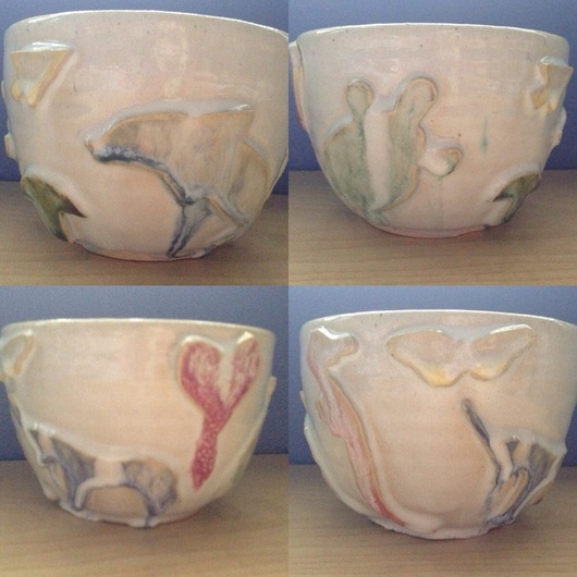
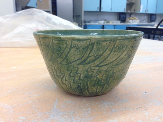
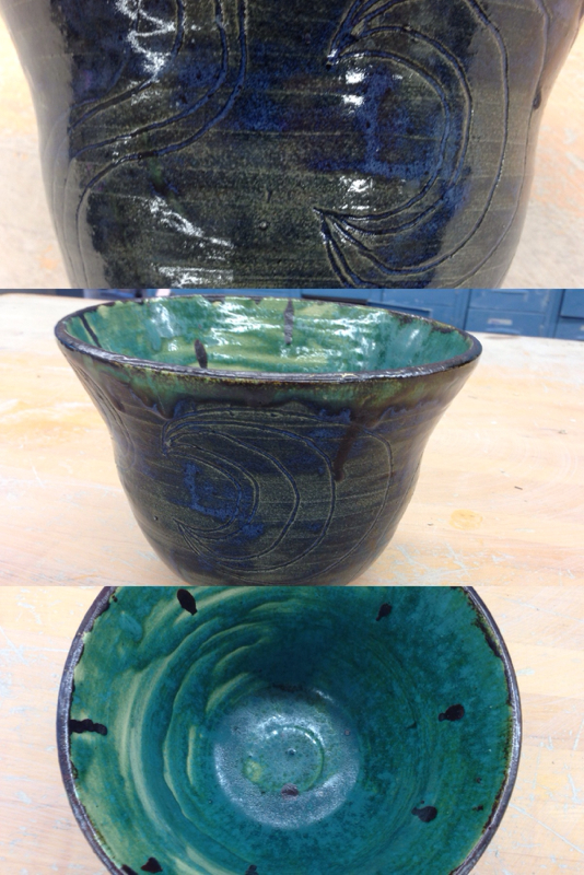
This is an extra bowl I made. I wanted to play with all the cutouts in the cupboards and this seemed playful and fun. Unfortunately when I glazed it, the white glaze ran like CRAZY creating this weird, marbleized, runny look but this reinforces one of my favorite art motos that art can't be ruined. This runny glaze created something I could never make by myself. I love that art can be made by accident. I think it has a surrealist, psychedelic mood because you can see the shapes that it's supposed to have and yet the colors have bled and new shapes and textures have been made. I like it a lot.
This is an extra porcelain bowl! The design wasn't really intentional....I shall explain. This bowl was extremely frustrating. I wasn't really happy with the way it turned out in general (it's really thick, I footed it poorly, etc). And then when I went to glaze it the blue/grey glaze I like was SUPER thick. I didn't really care until it started chipping off which is when I got REALLY annoyed, took a carving tool and scratched all the chipping sections off. And then I put clear in the cracks and voila. I think the mood of this piece is sort of numbing. When I look at it I think of storm clouds and tiredness. Maybe when I look at it I still see all the frustration I went through, but it's funny that that frustration somewhat translated into the art. I think that's both amazing and completely obvious. This is my wheel altered! It's a bowl with bent edges to create a wavelike effect around the outside. It's made with porcelain which you can sort of tell due to the shininess and white edges around the outside. This is obviously not my best project but I still learned a lot from it. It's weird, when someone is in class and their project gets really off center or the top collapses someone near them will be like "That sucks, just make it a wheel altered!". So to me, wheel altered projects were always the screw ups. The ones that didn't turn out the way you planned. This one came about exactly the same way though! I messed up with recycled porcelain, got annoyed, messed with the edges and then gave it a crappy glaze job. But the weird thing is that even though I put no effort into this project, I still really like it. I like the way the blue looks with the twisting shape. I like the way the twisting shape reminds me of waves. I love how calm light blue makes me feel. So I guess I learned with this project that art is art. It doesn't always make sense. This is my choice project! It's a large cylinder with a pretty flower carved into it that I gave to Mrs. Lucking because she is always so nice to me and loves my ceramics projects when I bring them into her class. I think this project conveys a happy but classy tone (I know, how can a tone be classy? I shall explain). I was really thinking about lucking when I made this so I tried to convey the way she is with her beautiful and posed exterior but with a snarky brilliance on the inside. This is flowy and flowery on the outside, but really, if you think about it, any of my designs are just lines and dots! And yet I've somehow been able to take something so simple and made it look complicated. That is Lucking to me. And so I made her a cylinder to match. This is an extra bowl I made! It has a really weird pattern because I was bored one day and just decided to get weird. This bowl is 8 inches across and 6 inches tall. The main art element it uses is texture but I also tried some dark/light contrast with the glazing. I also thought the splotchy rubbing off of the green glaze would add to the texture from the carving. I think this bowl represents a calm mood because to me, the green reminds me of moss and the outdoors and looking at it, I feel just as happy as I might be sitting in a field on a sunny day. I gave this bowl to Maile so she can use it in college and think of me :) This is an extra project I've made. It's a large bowl, 8 inches tall and 8 inches wide. It's glazed with turquoise matte on the inside and dark blue on the outside with swirly moons carved into the outside and drops of black on the inside. All of this sounds like a lot but in the end I think it works well together. The piece isn't too cluttered or too busy. It represents a thoughtful mood because of the darker tones and larger shape. I'm really proud of this bowl because it's been really hard for me to throw big for a long time and being able to make this sort of threw me out of my funk :)
This is my extra porcelain cat cup! It's only 3 inches tall but I love it. It's made of porcelain glazed with red and pink underglaze cats stamped into its surface along with clear over the top. Its art element is cuteness of course and the stamp's non-perfectness gives it a nice cute sort of character. It sits in my room and I smile whenever I see it :) This is a 6 inch wide plate made out of red clay and glazed with light blue glaze. You may be noticing the blatant lack of any design or... love put into this plate and there is a very simple explanation. I hate plates. I hate making them and I especially hate footing them and by the time I'm done I just want to put them on the cart and never look at them again. So yes this plate is just blue. Its simplicity expresses my frustration in plates. I glazed it as sort of a test because I was curious to see how the red clay and blue glaze would look together and since plates are dumb I didn't care if it didn't turn out very well but it's not completely awful. The splattering where you can see the red clay is like my frustration bubbling under the surface. The art element it displays is simplicity and clarity. There is nothing confusing that needs pondering when it comes to this plate. It hides nothing. It isn't a grand metaphor. It has no facade. It's just a blue plate. The three of these are porcelain cylinders which I have dubbed my "Henna cups" because of the designs on them. None of them are very tall , the tallest being 4 inches and the shortest being 3 inches. But what they lack in height they make up in design. I fell in love with some henna tattoo designs on the internet a few weeks ago and wanted to see how they would look on clay. I knew it would take a while to draw and carve them but it was worth it. I wanted to combine the pristine white surface of the porcelain with the bold lines of underglaze on the designs. I tried different colors but I think I like the black the best because it has the most contrast. The overall feeling that these exemplify is a peaceful pondering. I like the way complex designs like these are actually extremely simple when you look at each component of them. It mimics life in a way that the most complicated situations can have the simplest solutions. Overall I'm very happy with the way these turned out! I like them better than my first set of three! And I found out that I really like doing things in sets like this... Maybe I'll do more! This project is 6 inches tall and 4 inches wide. I like this tall project a lot more than my other one because to be honest, the other one sort of sucked. I wanted to prove to myself that I could actually make something taller than normal and make it look nice, and I even painted some nice little waves on it. The mood of this piece is tranquil because instead of confusing the piece with lots of colors and textures I just have the green with blue, both cool colors, that work together to compliment the symmetry of the piece. |
Archives
May 2014
Categories |