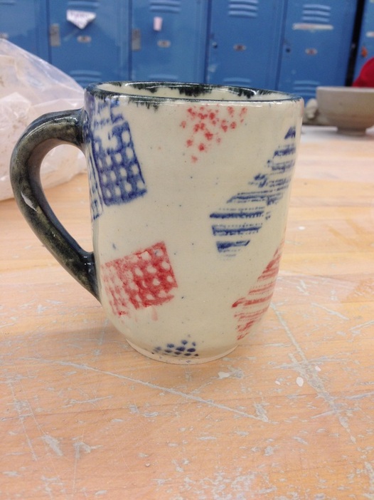
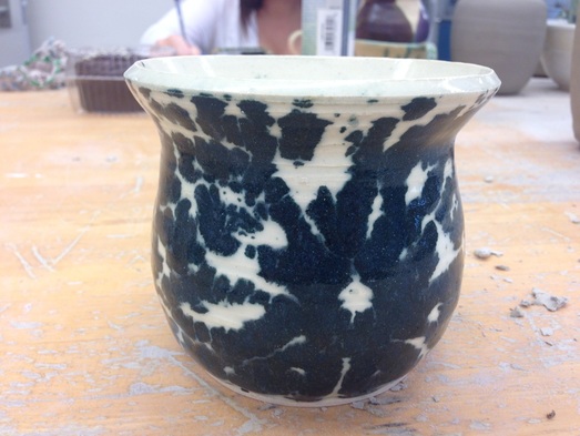
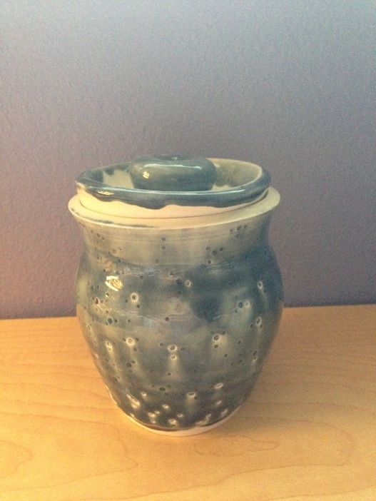
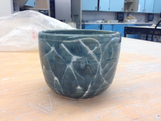
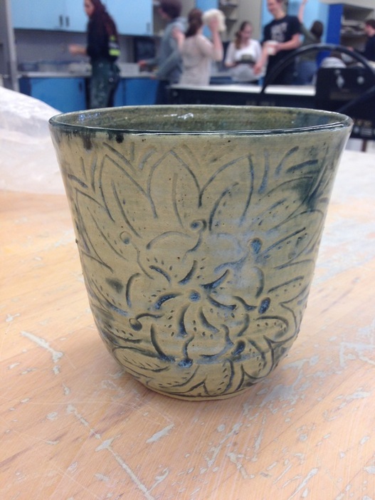
This is my extra hip mug. It is both extra credit, and just exceptionally hip. I wanted to make a nice gift for my friends Madelyn who compliments my ceramics projects every single time I bring one to class with me (which is frequently, as you can assume). She's a very hip person so I wanted a mug that would be as hip as she is. I came up with the idea for the glaze idea after I had such success with my last vase (bellow) with using the tape to segregate areas of glaze and I hadn't used my pattern stamps in a long time so I combined the ideas to create this look. I feel like the mood of this mug is classy but with like a funky twist. It has a pattern, but it's still random. The lines are clean and yet unfocused. It's a bit contradictory but I think it says a lot about Madelyn and works really well for her.
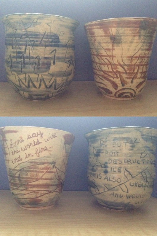
 RSS Feed
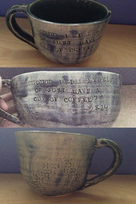
